ACAPS' Case Study: Using visuals to enhance analysis

Illustration by Sandie Walton-Ellery
ACAPS produces global and crisis level reports based on data analysis to guide humanitarian response. During the second H2H Covid-19 activation, discussions with internal and external analysts and experts resulted in identifying three themes; Gender, Education and Migration where a strengthened evidence base and related reports could support pressing policy decisions. ACAPS subsequently provided a series of reports on these issues to guide the scale-up and reorientation of humanitarian action in response to the pandemic.
Throughout their Covid-19 reporting, ACAPS made a determined effort to improve availability and accessibility of their analysis by including illustrations in their reports. ACAPS suggest that these illustrations increased audience outreach and were also useful to explain complex analytical concepts. This increased use of visuals within ACAPS products is driven by a ‘strategy to change the way the humanitarian architecture functions through advocacy and innovation’.
This case study locates the work ACAPS is doing with hand drawn analytical illustrations within the theory on how visuals enhance the accessibility of complex information. It also demonstrates how ACAPS’ products have benefited from the use of visuals and looks ahead to how ACAPS want to integrate and improve on this area of work.
Accessibility through visuals: theory
Visual communication dates back over 40,000 years, when the earliest civilisations used cave walls as canvasses to share knowledge, beliefs and stories. The human visual system evolved to process information through simultaneously viewing multiple images. Text or words emerged later on in human development, but in comparison to images words must be viewed one character at a time (Savikhin A.C. 2013).
Human memory is extremely sensitive to symbols within information. Numerous experiments and studies have demonstrated that pictures and images are more likely to be remembered than words, a phenomenon known as the picture superiority effect. It is a phenomenon that explains how images are embedded into our memory twice, causing us to understand and remember the information better than through words (Nelson, D. L., et al. 1976).
Visual communication has become a key tool to communicate complex analysis because analytical information can be generated with such velocity and volume that it can’t be comprehended without a layer of abstraction (Harvard Business Review 2016). Researchers have looked at which parts of the brain were active during visual stimulation. They found that in addition to the association cortex, the visual cortex is involved in decision-making. This tells us is that the visual cortex controls more than interpretation of images, it has actual decision-making power (MSU Today 2015). This evidence suggests that the use of visuals can aid the accessibility of ACAPS’ analytical reports by improving the recall of the salient points, and additionally that by engaging the visual cortex, the use of visuals can contribute to decision making based on ACAPS’ analysis.

Reproduction of a prehistoric cave painting showing a hunter and deers. Image by Roxana Gonzalez
Source: ShutterStock
Accessibility through visuals: practice
A picture can tell a thousand words – but only if you can see it.
English is not the first language of many humanitarian practitioners. In difficult, time-pressured situations, it can be especially hard to find the time to read long and complex narrative reports. We hope that providing a range of different visuals can help non-native readers to quickly capture some of the key points of our analysis.
We also recognize that for anyone with a visual impairment, there is nothing gained through sharing information visually unless all visuals, including graphs and charts, are accompanied by plain text that accurately describes the images. This text should then be embedded within the visual for text-to-speech readers. ACAPS hasn’t done this yet, but it is a direction we hope to be able to go in.
Within analytical reports, visual communication that combines text and image offers the highest degree of accessibility to readers. It offers a choice between redundancy, which means that text and graphics have the same intention—like a furniture construction manual—and complementarity, which requires the reader to understand both the illustration and text—like a comic (Accessibility Blog 2018). Redundancy is best for complex and detailed information. Complementarity is best to summarize and propagate the main message, in the same way that photojournalism accompanies a story.

Illustration by Sandie Walton-Ellery
The next question to ask is whether the image is explaining something or exploring something? Either you’re visualizing qualitative information or you’re plotting quantitative information: ideas or statistics. Explanatory visuals direct viewers along a path and are useful for communicating changes within a crisis or environment. Exploratory visuals offer the viewer many dimensions or perspectives on a data set and ‘invite engagement that leads to discovery’.
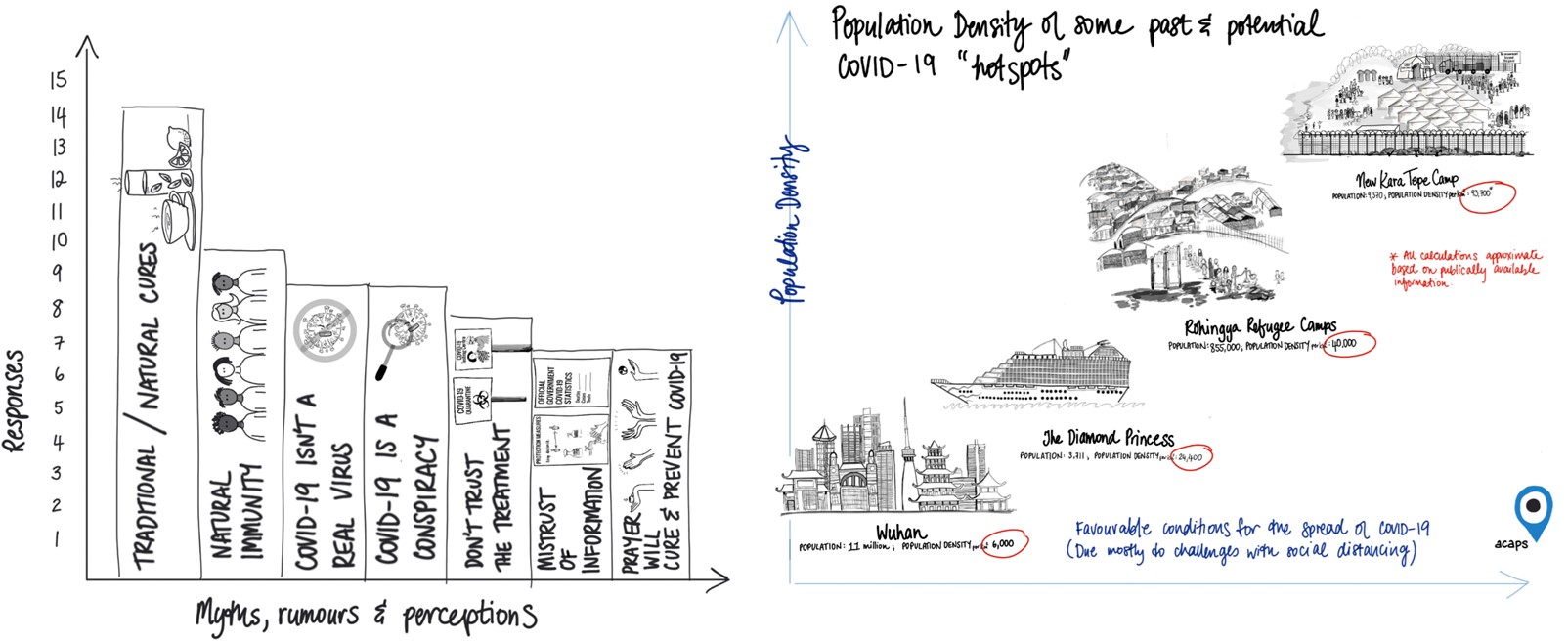
Image on the left: This ‘redundant’ visual presents dense information that would have required many sentences of text to explain. Illustration by Sandi Walton-Ellery
Image on the right: This exploratory visual offers a perspective that can lead to discovery of additional data. Illustration by Sandie Walton-Ellery
Accessibility through visuals: process
How best to use hand drawn visuals as part of visual design within the analysis process? While it is true that hand drawn illustrations add to the visual appeal of our products i.e. maps, tables and graphs, they are only useful if they enhance the user friendliness of our products. The same is true for hand drawn analysis.
The illustrator, GIS specialist and data scientist roles are included in the team working on a product and are brought in as early as possible to conceptualise the visuals to be used.
Key questions we ask in determining the need for, type of and content of a visual include:
- Where is the information gap greatest?
- Who is the decision maker?
- What information is the most salient?
- Does an illustration concept come to mind immediately?

Illustration by Sandie Walton-Ellery
The Role of the Product Manager is one of accuracy. Prior to the review phase, the Lead Analyst should write a description of the visual using plain language. Without reading it, the Product Manager should form his or her own interpretation of the visual. Afterwards the Product Manager should explain his or her interpretation to the Lead Analyst to determine the accuracy of the visual and the description.
The Role of the Content Reviewer is one of verification. During the review phase, the Reviewer should determine their own interpretation of the visual and verify whether it enhances the accessibility of the information being presented, and whether the description matches the visual.

Illustrations by Sandie Walton-Ellery
Accuracy is critical to the use of any visual, particularly where hand drawn illustrations are concerned as there is scope for misleading the reader if the visual does not match the text in terms of both content and emphasis. To quality control this part of the process, our review of the analysis includes interpretation of the hand drawn visual first without reading the written description of it.
There are risks associated with drawing people, particularly people who are already vulnerable because they have been impacted by crises. ACAPS acknowledges this risk and takes it seriously. Wherever possible we use people from the groups we are representing and work with experts on context to help us make sure we present people in ways that show their inherent dignity and in contexts which are accurate to the degree they do not distract the reader from the key messages. Our illustrations use simplification and abstraction to highlight the points being made by the analysis and it is always our intent to represent people with respect.
Drawings enable us to show things we cannot use photos for because they would be too sensitive or potentially be able to identify locations that could raise concern for individuals sharing information.
Feedback we have received and the uptake of our illustrated work by other organizations, suggest that our work with drawn visuals has been worth it so far in helping to draw attention to the important messages contained in our analysis. We are however always ready to receive comments and criticism and to abandon this line of our work if it becomes the best course of action to do so.
Sign up to our newsletter
The latest H2H Network news, impact stories and resources, sent straight to your inbox every month.